So, how do we actually build these ‘speed bumps’? As a digital marketer in Kerala, I often tell clients that it’s not about using the brightest neon colors or the loudest fonts. It’s about leveraging visual psychology to guide the user’s eye. Here are the core principles I use to win that critical 3-second window:
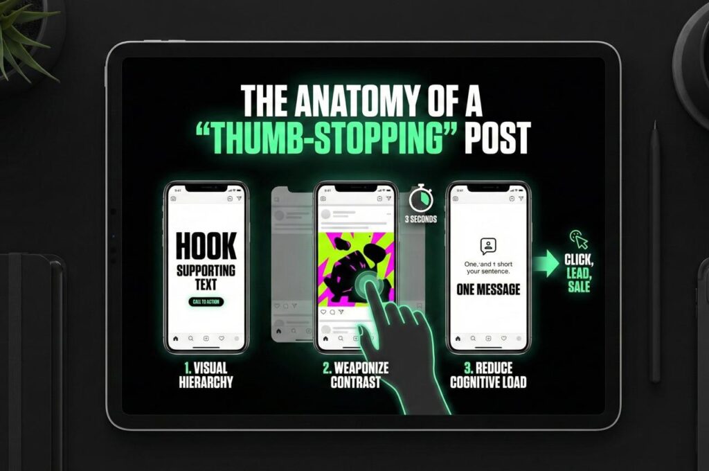
1. The Hierarchy of Information
If everything is big, nothing is big. As a digital marketer in Kerala, I frequently see this error in DIY social media posts. The temptation is to make the logo, the headline, the offer, and the website URL all equally large to maximize visibility. However, design doesn’t work that way. When every element screams for attention, the viewer gets overwhelmed and scrolls past.
Effective design requires a clear path for the eye. In that critical first second, the user should see exactly one focal point. Usually, this is the ‘Hook’—a bold headline or a striking image that poses a question or promises a solution. The secondary details (like the pricing or the ‘how’) must act as supporting actors, not the stars of the show. By controlling these sizes, you control the narrative.
2. Contrast is King: A Digital Marketer in Kerala’s Perspective
Most social media interfaces (Instagram, LinkedIn, Facebook) are white or dark mode grey. If your creative blends into that background, it becomes invisible. I utilize high-contrast layouts—think dark text on light backgrounds or vibrant splashes of color against ample white space—to create a visual disruption. This disruption signals to the brain that “this is new content,” prompting the thumb to stop.
It is also worth noting that contrast isn’t just about black and white. As a digital marketer in Kerala, I advise clients to use a color wheel to find high-contrast pairings that grab attention. It is about complimentary colors. Using a color wheel, find the color opposite to your brand’s primary color. If your brand is blue, use orange accents for your call-to-action buttons or headlines. This visual tension naturally draws the eye and forces the user to pause, which is exactly the ‘speed bump’ effect we are aiming for.
3. The “Less is More” Philosophy
Clutter is the enemy of attention, a fact that any digital marketer in Kerala will tell you immediately. When a viewer sees a graphic packed with three paragraphs of text, their brain calculates the “cognitive load” (the effort required to process it) and decides it’s too much work. My rule is simple: One creative, one message. If you have three points to make, that’s three separate posts (or a carousel), not one crowded flyer.
4. The Human Connection
We are biologically wired to look at faces. As a digital marketer in Kerala, I use this biological trigger to increase engagement rates on client campaigns. Studies show that images including human faces—specifically eyes—draw attention significantly faster than text or abstract graphics alone. But here is the marketer’s trick:
If the person in the image is looking at the text, the viewer’s eyes will follow their gaze. I use this directional cue to subtly force the user to read your headline. Design with Intent, Not Just Aesthetics. The “3-Second Rule” separates art from design. Art is about expression; design is about function. In digital marketing, a “pretty” post that gets scrolled past is a failed post. A “strategic” post might look simple, but if it stops the scroll, engages the mind, and leads to a click, it has done its job.
5. The Tools of the Trade
You might be wondering what software is best for creating these thumb-stopping visuals. As a digital marketer in Kerala, I often experiment with various tools, but sticking to the industry standards usually yields the best results.
While tools like Canva are fantastic for quick edits and templates, Adobe Photoshop allows for the precise manipulation of layers and lighting that creates that “cinematic” feel we discussed earlier. The key isn’t the price of the software, but how you use it to control the hierarchy. Whether you are using free tools or premium software, ensure your tool allows you to manipulate contrast and spacing effectively.
Don’t let your brand get lost in the infinite scroll. Let’s create visuals that don’t just ask for attention—but command it.
If you are looking for a freelance digital marketer in Kerala who can help you design visuals that convert, feel free to reach out to me directly.